Responsive Website Development
Can One Size Really Fit Every Website… and Every Customer?

Can One Size Really Fit Every Website… and Every Customer?
A great custom business website is like a fine suit, designed to show off all of your company’s strengths in a way that draws attention and builds credibility at the same time. But what happens when your customers come to you on smaller mobile screens, or with browsers that aren’t common? Do you have to settle for making a less-than-perfect impression?
With Medora’s responsive web design, you don’t have to worry about your business website displaying and functioning the way it should. That’s because it adapts itself to each user, optimizing your site for their screen size and browsing platform – it’s like a tailored suit that adjusts its own measurements for each customer, making your business website more adaptable, and more profitable.
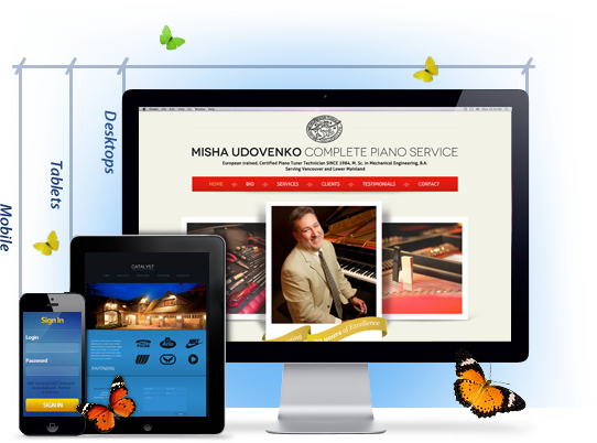
With responsive web design, it doesn’t matter if customers visit you through traditional computers, smartphones, tablets, or other mobile web devices – your business website is always ready.
Studies show that more than 60% of users prefer mobile devices for everyday browsing, and mobile computing will overtake “traditional” Internet use by 2014.
Google and the other major search engines prefer responsive web designs, since they mean more reliable results for users. Why not make your site easy to find, and easy to use, at the same time?
Why maintain several versions of your business website at once, when one responsive design can work for many different systems including iPhones, Androids, iPads, Kindles, Nexus, and more?
Responsive web designs are adaptable for lots of different devices and platforms, so they will last longer. That means more use from your new site, and fewer upgrade costs in the future.